We created and developed a new brand and website for Scottish Financial Enterprise.
We completely redesigned and redeveloped the brand from the ground up, with entirely new thinking behind the new modern style.
With a new strategy in place, SFE briefed us to completely transform, and modernise, their current brand. From the identity, to their website, and everything in between, we created an entire new brand style for SFE, and rolled it out across all their collateral.
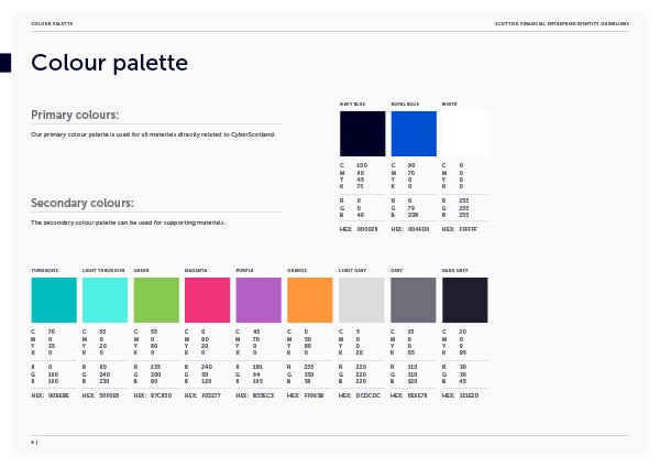
Developing the colour palette and typography.
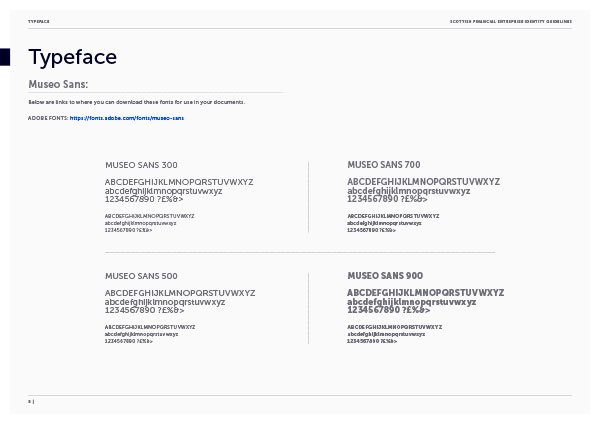
We took the existing SFE colour palette, and added a secondary palette to give more flexibility across the brand collateral. We also simplified the typography, using the Museo typeface across everything from brochures to the website.
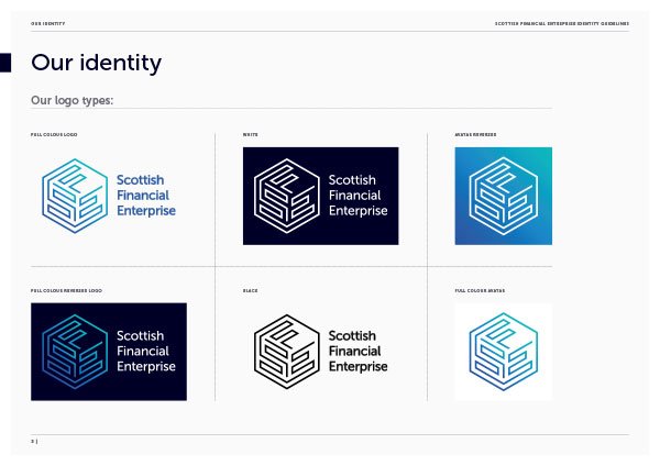
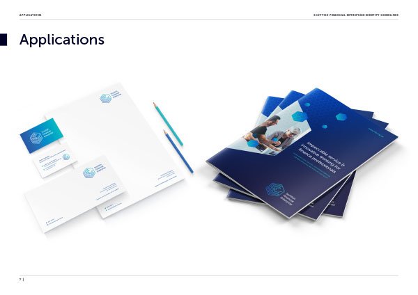
The final identity, in all its forms.
We developed a range of final logos to work across a range of background colours.
An avatar for every social platform.
We also developed a range of 3D Identities, for possible future development.

Adding the finishing touches.
Keeping everything up-to-date and on brand.
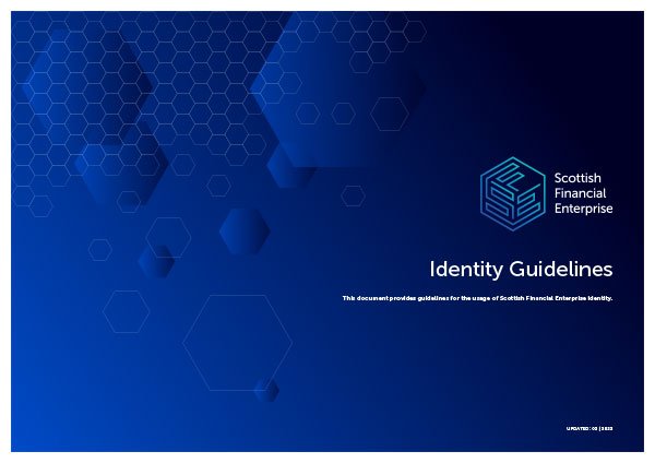
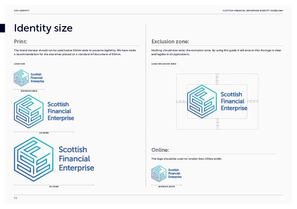
We developed a set of identity guidelines, so anyone, and everyone, can work on the brand, and know they are producing the same materials.
Designing the unique brand templates.
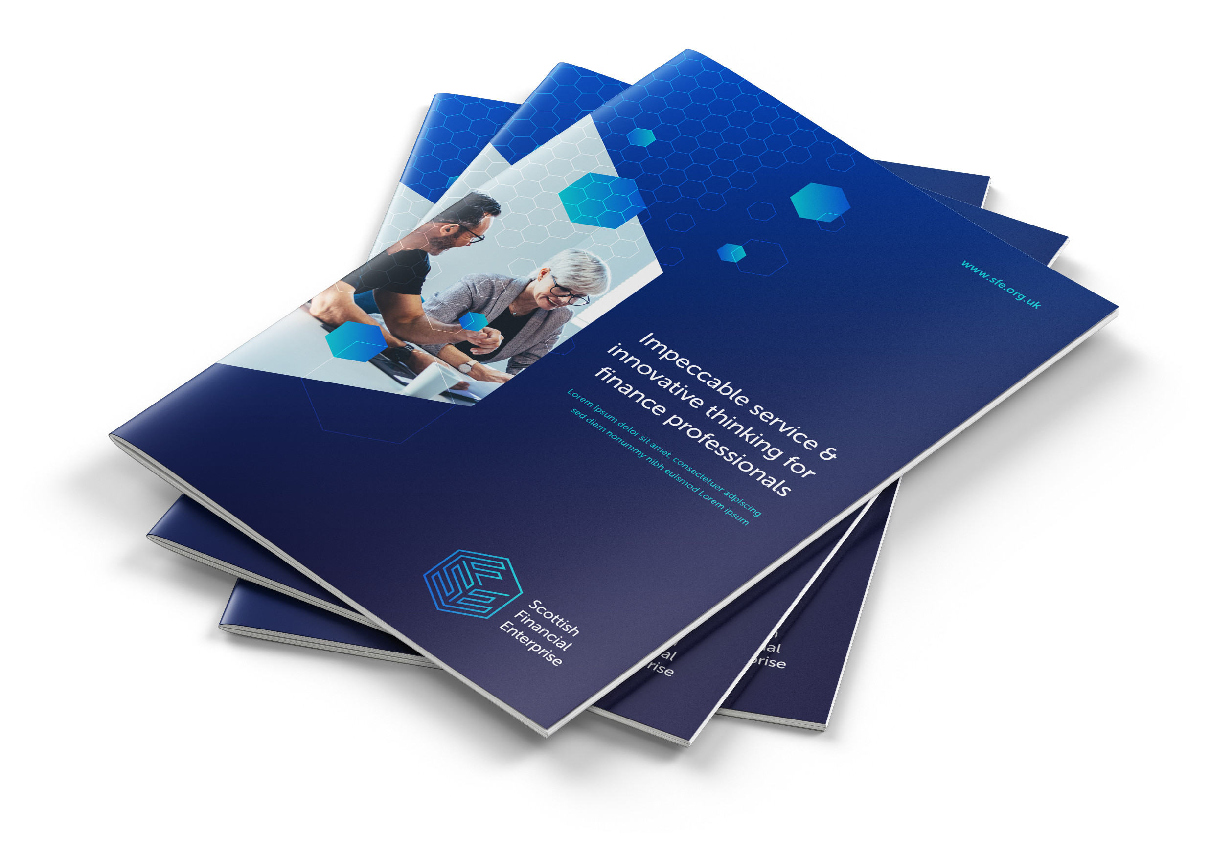
We designed a range of report templates to cater for every requirement, large and small. With distinctive cover designs, every report is easily recognisable as a Scottish Financial Enterprise publication.
Each page carefully designed, with lots of clean, white space.
We designed the spreads with a range of heading styles, clear page furniture, quotes, tabs and pagination.
Bringing everything together on the website.
We design and developed a website from the ground up to work with the Scottish Financial Enterprises existing backend database delivered by VeryConnect.
Visit www.sfe.org.uk to see the final results


